A perfect PageSpeed score did not come from removing the portrait, switching everything to a system font, or turning the homepage into an empty box. I reached it by treating performance as part of the architecture: ready-to-render HTML, a discoverable hero image, only the CSS the route uses, local font subsets, very little client JavaScript, and build budgets that prevent regressions.
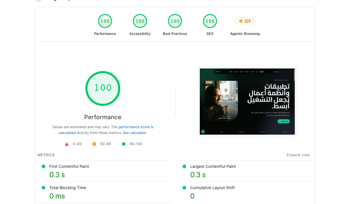
In the actual PageSpeed Insights report for yasirnajeep.com, captured on 19 August 2026, the homepage received:
| Category | Score |
|---|---|
| Performance | 100 |
| Accessibility | 100 |
| Best Practices | 100 |
| SEO | 100 |
What the result actually measured
The desktop lab metrics were:
| Metric | Result | What it describes |
|---|---|---|
| First Contentful Paint | 0.3 s | When the first content appeared |
| Largest Contentful Paint | 0.3 s | When the largest important element appeared |
| Total Blocking Time | 0 ms | Main-thread blocking during load |
| Cumulative Layout Shift | 0 | Unexpected layout movement |
| Speed Index | 0.3 s | How quickly visible content completed |
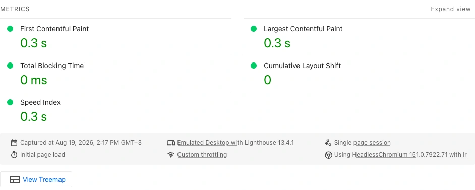
This is lab evidence, not a promise that every visitor on every phone and connection will load the page in 0.3 seconds. Google’s PageSpeed Insights documentation distinguishes controlled Lighthouse diagnostics from 28-day real-user CrUX data. This report says No Data for the real-user section, so I do not present a lab score as confirmed field performance.
1. I started with ready HTML, not a JavaScript waiting room
The site uses Astro with static output. Pages are generated during the build and delivered as ready HTML from Cloudflare Pages. The browser does not need to download a large application bundle before it can show the heading, portrait, navigation, or call to action.
That matters because render delay is not only a network problem. A resource can finish downloading and still wait behind JavaScript work on the main thread. Astro components render to HTML without adding client JavaScript by default, while Astro’s static rendering mode prepares the page before the request arrives.
Tip: for a marketing page, article, or portfolio, first ask whether the route needs to be a client-rendered application. Add JavaScript for real interactions, not to reconstruct content that could have arrived in HTML.
2. I made the LCP resource discoverable immediately
The homepage uses a real portrait as its main visual. It is an <img> in the initial HTML, not a late JavaScript insertion or a CSS background discovered after another request.
The image has:
- eager loading because it is above the fold;
fetchpriority="high"because it is an LCP candidate;- explicit width and height to reserve layout space;
srcsetandsizesso each screen gets an appropriate file;- WebP output at a measured quality level.
<Image
  src={portrait}
  width={720}
  height={717}
  widths={[384, 512, 640, 720]}
  sizes="(max-width: 560px) calc(100vw - 2rem), 31rem"
  format="webp"
  quality={76}
  loading="eager"
  fetchpriority="high"
/>
The official LCP optimization guide recommends making the LCP resource discoverable from the initial HTML and avoiding lazy loading for it. Fetch Priority guidance supports giving a likely LCP image high priority, but not marking every image as high priority.
Tip: do not treat compression as the whole image strategy. Match the delivered dimensions to the rendered size, use a suitable format, reserve the layout space, and verify request priority in the waterfall.
3. I shipped the CSS the homepage actually uses
Inlining one complete site-wide stylesheet removed a request but made the HTML unnecessarily large. Loading the full stylesheet asynchronously reduced blocking, but a late second application of CSS could hurt Speed Index or create visible change.
The final approach analyzes the generated homepage during the build, extracts the rules that match its DOM, compresses those rules, and places them in the document. The homepage then removes its redundant external stylesheet request. Other routes keep their normal shared stylesheets.
I used Beasties for the critical CSS extraction. On the live route, this reduced the homepage HTML from roughly 153 KB to roughly 77 KB and left no external stylesheet requests on that route.
The reusable rule is more important than the library:
- Do not block first paint with a large stylesheet.
- Do not inline the entire site’s CSS into every page.
- Do not let the full design arrive after the user sees an unstable first state.
- Verify the rendered result, not only the audit label.
4. I prioritized the fonts the current language needs
Typography is part of the identity, so I did not remove it to win a benchmark. The site self-hosts WOFF2 files. Arabic pages preload the required Arabic Cairo weights. English pages preload the relevant Space Grotesk and Syne files instead of making every visitor download every language subset and weight.
<link
  rel="preload"
  href="/fonts/cairo-arabic-700.woff2"
  as="font"
  type="font/woff2"
  crossorigin
/>
Tip: use local WOFF2 files, request only real weights and subsets, and inspect the waterfall. An unnecessary font preload can compete with the LCP resource.
5. I deferred rendering work below the fold
The sections below the hero do not need complete layout and paint work before the visitor reaches them. I use content-visibility: auto with an intrinsic size that keeps the scroll geometry stable:
#main-content > section,
#main-content + footer {
  content-visibility: auto;
  contain-intrinsic-size: auto 56rem;
}
The content remains in the HTML and remains available to search engines and assistive technology. The browser can defer part of the rendering cost until the section approaches the viewport.
Tip: validate the intrinsic size at mobile and desktop widths. A poor estimate can trade rendering work for layout movement.
6. I stopped floating controls from competing with the hero
The WhatsApp action is useful, but on a small screen it could cover the hero call to action or portrait. An IntersectionObserver keeps it hidden while the primary hero action is visible, then reveals it after the visitor leaves that area.
This is not a shortcut to a higher PageSpeed number. It is an example of a broader rule: performance includes usability. A fast page with obstructed content is not a good result.
7. Accessibility and SEO live in the components
The four perfect scores came from a shared foundation rather than an audit-day patch:
- correct language and direction on
<html>; - a skip link to the main content;
- semantic headings and landmarks;
- visible focus states and keyboard navigation;
- image alternatives and explicit dimensions;
- self-canonical URLs and reciprocal hreflang for real translations;
- structured data for articles, the person, services, and breadcrumbs;
- unique titles, descriptions, and real social images.
Automated accessibility checks only find a subset of issues. I also tested the mobile menu, Escape dismissal, focus restoration, 320 px layouts, Arabic and English content, and reduced motion.
8. I added performance budgets to the build
An optimization without a guard will disappear when the next large image or library lands. The production audit rejects builds that cross limits such as:
- 120 KB for a CSS asset;
- 100 KB for a JavaScript asset;
- 30 KB for a font file;
- 180 KB for a referenced image;
- 48 KB for homepage critical CSS;
- any active render-blocking stylesheet on the homepage.
The release process also runs type checking, unit tests, an Astro production build, generated-HTML audits, and Playwright checks across desktop and mobile behavior.
Tip: enforce budgets in CI or the production build. A number written in documentation does not stop a regression.
A score of 100 did not mean I stopped
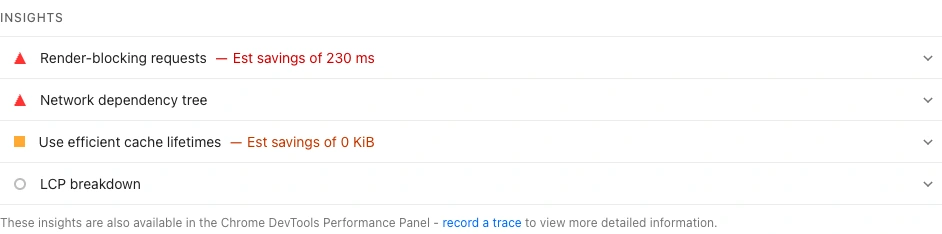
The same report that gave the route 100 still identified an estimated 230 ms render-blocking opportunity.
Lighthouse performance scoring documentation explains that scores can fluctuate with network routing, test hardware, browser extensions, and resource contention. I therefore do not trust a single run:
- Run at least three tests.
- Record the median and the worst result.
- Inspect the filmstrip and network waterfall.
- Test mobile and desktop separately.
- Compare before and after under the same conditions.
- Add field monitoring when there is enough traffic.
A checklist you can apply today
- Put the heading and primary image in the initial HTML.
- Never lazy-load the LCP image.
- Give every image dimensions to prevent layout shift.
- Deliver an image close to its rendered dimensions.
- Remove JavaScript that does not serve a real interaction.
- Check both render-blocking CSS and inline CSS size.
- Self-host only the font weights and subsets you use.
- Defer distant sections, then test layout stability.
- Test keyboard use, focus, language, direction, and structured data.
- Enforce page and asset budgets during the build.
- Run multiple measurements and use the median.
- Treat lab scores as diagnostics, not a replacement for CrUX or RUM.
The real outcome
I reached 100 because the page begins with useful HTML, exposes its most important resource early, does not make JavaScript a rendering gate, and loads images, fonts, and CSS according to what the route needs. Then I turned those choices into automated limits so the score would not be a one-day screenshot.
The green circle is evidence, not the product. The product is a page that appears quickly, does not jump, works from the keyboard, communicates clearly to search engines, and stays fast after the next change.